CSS (cascading stylesheets) is how we style the web. Anything you see on a webpage that isn’t black Times New Roman left-aligned on a white background has been styled with CSS. It’s so prevalent that everyone from web developers to designers to SEO professionals to bloggers have tried their hand at it.
But, the majority of people, even those who write CSS regularly (and those who get paid to do it), don’t understand the fundamentals behind how CSS works. This leads to hundreds of lines of unneccessary styling, and a general distaste for CSS. </rant>
On the other hand, I really like CSS. I know you’re probably making a funny face at your screen right now, and that’s okay. If you don’t understand CSS, it is totally frustrating and nonsensical. I get it.
The reality? Once you learn how to think in a CSS mindset, you can implement any design efficiently and frustration-free. CSS doesn’t have to be trial-and-error.
After years of listening to CSS-hate, I created a set of interactive playgrounds to visually represent fundamental CSS concepts.
These playgrounds let learners interact with CSS concepts with no coding required. Taking away coding lets the student get immediate visual feedback and focus on understanding the underlying concept without worrying about their own HTML/CSS structure or syntax. Of course, I recommend trying out the concepts yourself during/after to solidify your understanding!
Introducing three basic interactive playgrounds:
Interactive Box Model →
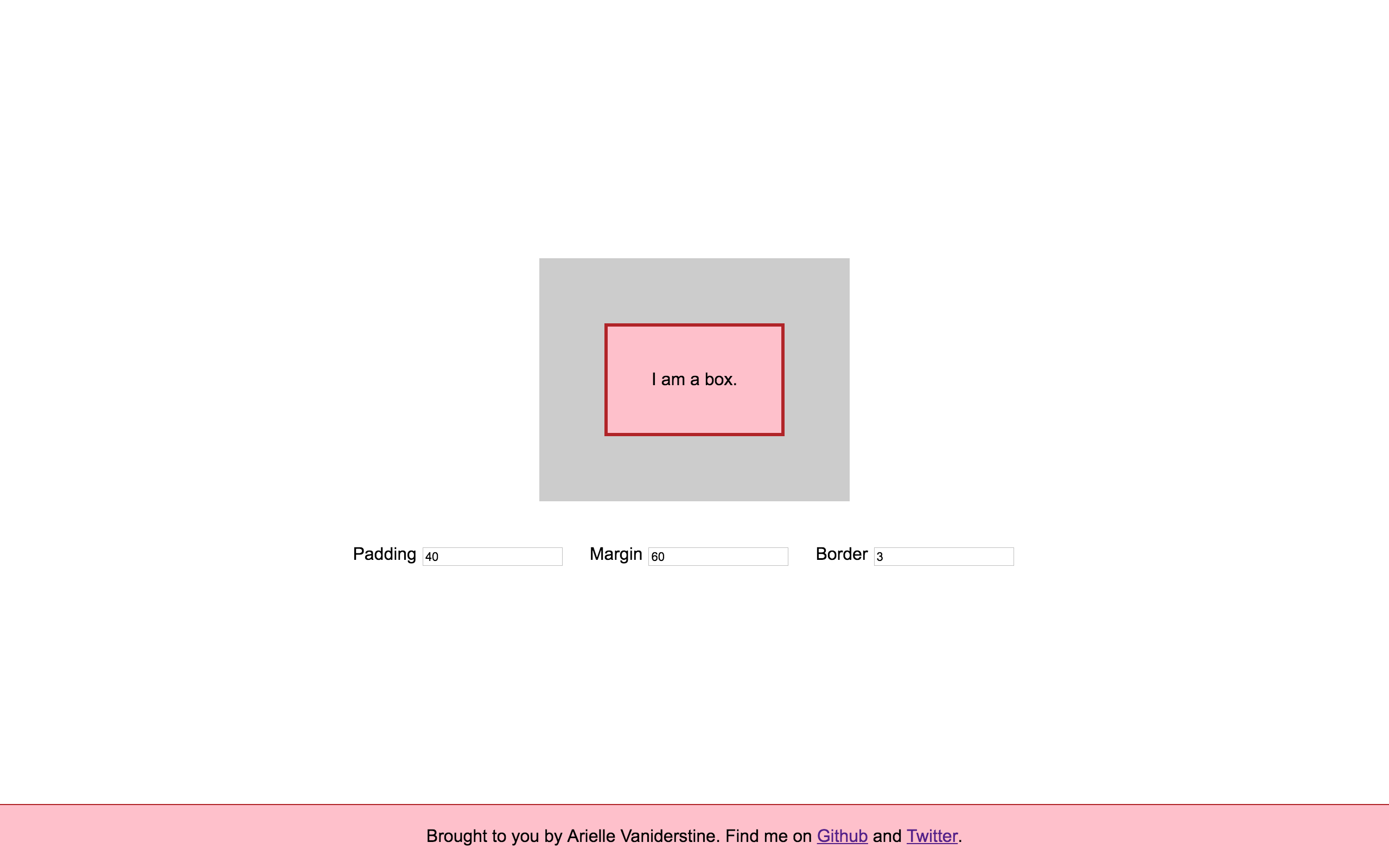
Every element in CSS (well, every block element - more on that below) is a box. Some boxes have borders, some have space inside them, and some have space around them. Understanding how to manipulate that space is critical if you want to create layouts in HTML and CSS.
If you have ever wondered whether you should adjust the margin or padding to get the desired result (or worse, you think those two properties are interchangeable), you could probably use a refresher on the box model.
Interactive CSS Display →
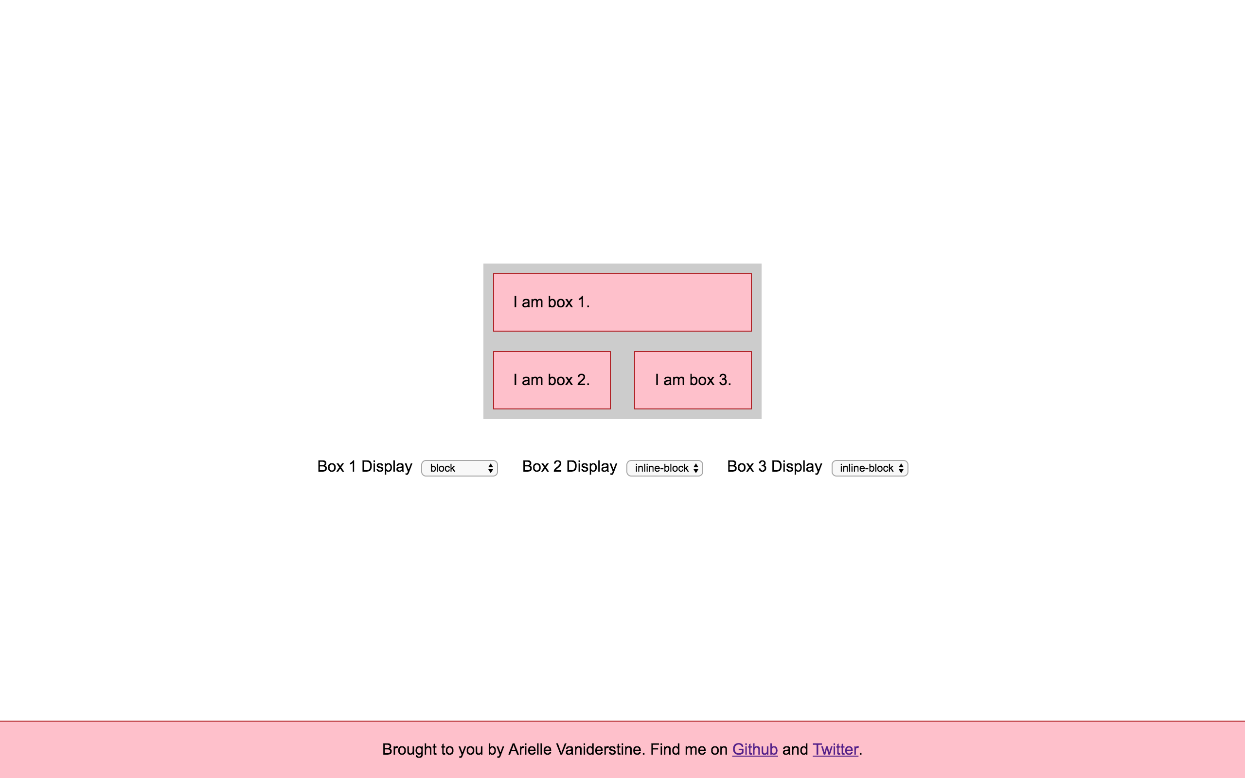
I’m always shocked when people who write CSS don’t understand what implications an element’s display property carries.
Elements like div, p, h1, and form are block elements by default. Elements like span, a, strong, and input, are inline by default. Have you noticed that a new paragraph is always on a new line, whereas a link stays within the same line? Have you not been able to set width, height, or margin on certain elements? CSS Display is the culprit. Understanding display properties can help you choose the right built-in HTML elements and lay out your pages more efficiently.
This interactive model desperately needs some documentation or explanatory text, as a few of the arrangements are confusing if you don’t know what’s going on. I’ll be adding that soon.
Interactive Flexbox →
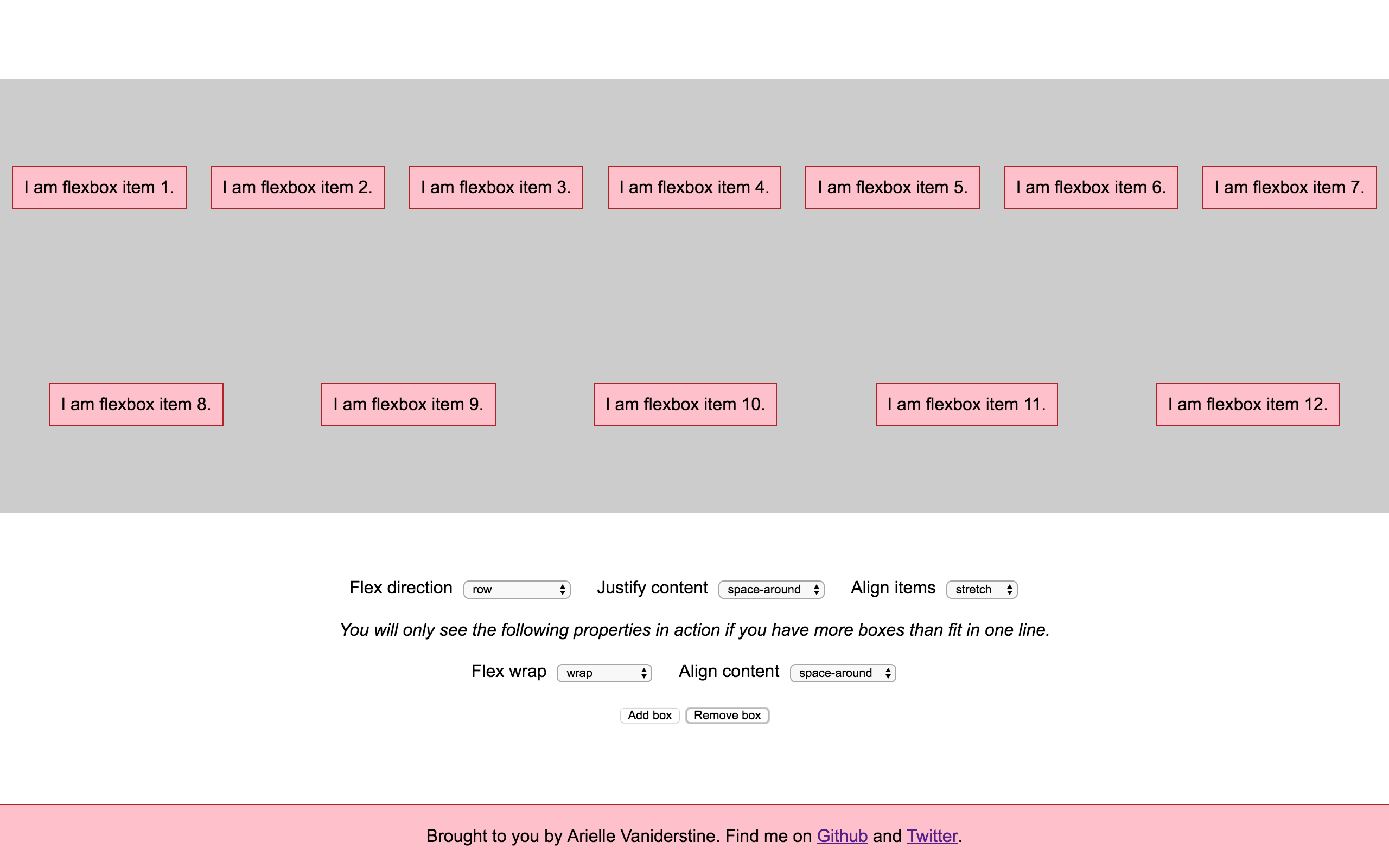
Flexbox is a hot topic in the CSS world.
Technically, it’s another display property, just like the above, but flex elements have several extra properties that control orientation, spacing, and sizing, giving the property its real power.
I’m most proud of this interactive snippet, and I think it’s the perfect accompaniment to my go-to explainer on Flexbox.
What’s next
Supplementary material
In the coming weeks, I will be developing documentation, explanations, and challenges to go along with the interactive elements. Please contribute if you have ideas for supplementary material!
Improvements
Please tweet at me, open issues, and/or submit pull requests to any of the above repositories to help make these tools more useful. I’ll be making changes in direct response to feedback from the people using these!
Future interactive playgrounds
- CSS Position (relative, absolute, fixed)
- Background (focusing on background images and their positioning)
- Relative sizing (% sizing, vw/vh, pixels)
- (Now accepting requests for further concepts)
Find me and my current projects on Github.
Talk to me on Twitter.